Looking back at the four months I had overall to do this project, I feel I have made a positive personal progress with my general production of work within deadlines. With previous projects I always got started positively then half way in between, slow down then put it off till I began to panic at the last minute and either not have completed it or the quality is not an example of what I have learnt. It happens to a lot of people but my reason is a struggle of where to start and all I do is spend time thinking about it. I think this final project has given more than enough time for me to get my head together, get my ideas together and have a finished product and I’m glad I managed to do that. Everyone's finished project will vary in size and quality depending on experience, knowledge, time given and motivation.

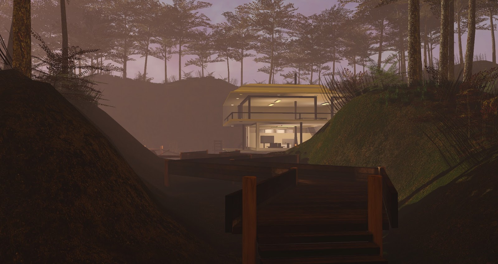
My brief was to achieve a natural, realistic foresty environment that displayed life, mood and atmosphere and a mix of rustic and clinically clean objects. I wanted it to be current gen Xbox 360 / PS3 / Wii U. That means hdr and bloom lighting, bump and specular maps, many assets on screen with highish tri limits but not stupidly high depending on object. Looking at my finished product, I am actually confident to an extent in saying I have achieved most of this. Then again, me saying 'most', the only thing I think I wanted to add more of in general was more assets with which would lead showing off a wider range of textures and baking more lighting and good shadow effect. The area I am talking about is the house section at the end.

I really could have added more around the windy turbine spot as planned, such as a fishing tackle box and a couple of fishing rods reaching into the lake. To add to that, a couple of fish varieties in the water would have been great. With the house itself, I think the cleanliness and foundations and room sizes are bang on what I wanted to achieve however, I could have broken up the upstairs a bit into two rooms maybe and added simple clean, geometric assets to indicate a bedroom and a bathroom so bath, shower, sink, bed, cupboard. Leaving it open plan though does leave a nice view when you climb the stairs, turn round and walk to the balcony. To break up the clean white spots, I could have added more to the outside or inside walls like that dear head I shown previous gathered reference, photo frames or weapons on display.

The forest, even though it looks busy with the three types of trees and two types grass and bushes all varying in size, adding a few non repeated and more interesting assets could have been made to break up repetitiveness if somebody wanted to search the forest. I could have made a small hut or a couple of gravestones visible from the plank path, inviting players to find a way into the forest and explore a bit.

I planned to make more weapons than just a simple axe and I wanted to fill up the shack more with interesting assets like rough or burnt paper on the walls, a few objects sitting on the table like a lamp or a carving knife. I learnt how to vertex paint in UDK also while finishing my rooftop project and, even though I dirtied up my "ikea bought" plank path, a few noticeably large patches of green moss would have blended nicely the make a more dirty swamp. A couple unusual swamp plants sticking out the water would have been a bonus alongside a murkier, less see through water pathway.

That’s enough about what could have been anyway as what I have achieved is more than I thought I could achieve. A warm atmosphere with a vibrant glowing sun, strategically shining through lightly moving leaves. Moving grass and bushes, firefly swarms during what looks like mating season around the open lake and a realistic flashy fireplace. A pathway broken up on your way to the house, forcing you through swimmable glittery water and candles that give off a bright flashy effect. I achieved bright glowing lights by adding a small bloom scale the level so that when the lights I set up shine on my emissive materials, they shine brighter than normal materials. This affected the fireflies too as they are made with emissive too. The house is clinical and clean which is what I wanted and makes a difference to the average run down, dirty, broken house everyone would expect in nearly all computer games. I indicated that the house is for sale too so it gives the idea, it might have just been built recently and is open plan for somebody to build it up more and make their own changes and give that homely touch it doesn’t yet have.

I reused a heck of a lot of the same wood texture but edited and painted a lot of variation around it to get different effects. I am comfortable with painting on grime or scratches, bright specular and effective normals using Photoshop and xnormal. I didn’t have access to crazybump at home and I found xnormal a lot better and easier for me to use, especially since it's free and I wanted quick results. Concept wise, I mainly went with a lot of what I found and after drawing out my plan, I saw in my head how I wanted it to go. Because my experience with digitally painting good looking scenes is still not very good, I thought, if I spent time trying to learn effective techniques and constantly start painting a bunch of concepts, I would waste a lot of time and become indecisive of the results. Watching and following tutorials is great but everybody’s technique is different and they all use their own set of favourite Photoshop brushes. I found some brushes I was comfortable with and stuck to them.
Unwrapping and light mapping was not a problem for me at all and i found new techniques especially with the more difficult curved objects. I would just cut some the edge verts into seams up to a sensible spot, use pelt map to stretch it really wide. Then to finish i would relax all polygons by face angles and most of the time they shape perfectly and evenly for neat looking textures. Sometimes aligning the uvs along 1 horizontal or vertical line (theres a button for in in the uv editor somewhere) then relaxing face angles also makes the uvs set out even neater.
I didnt really limit myself with tris or textures but i didnt go crazy and turbosmooth anything, except i was tempted to turbosmooth my dead tree asset at one point but i didn't. Most my relevant textures were 1024x1024 to make them more crisp in general. Some dead simple or tiled textures were 256 or 512. My package never exceeded the recommended UDK package size which is around 400mb. The sound only exceeded (one file being around 64mb) it which is why i put them in a separate package, also because the sounds are not mine, i found it better to keep them separate.

UDK obviously came with its faults along the way. Mainly the trouble I had with setting up my trees in the terrain editor affecting the lighting and the dynamic shadow issue leading to pretty annoying lag. Also, light mapping was a long and annoying process to get right, a problem I wouldn't have had if I used cryengine. Some of my plank posts were not lighting properly and as much as I would try to increase the lightmap resolution of some of the larger objects where shadowing was important, such as the house, it would only bake weirder. That was the only issue I had which was out of my control.

I hoped everything I created and set up makes sense. For once I completed a project on time and I am rather pleased with it. I can safely say my project was not a complete success, but a rather large visual and personal success and a great learning experience for future personal projects.
No comments:
Post a Comment